Getting Started
Watch the demo to see the drag and snap behavior in action.
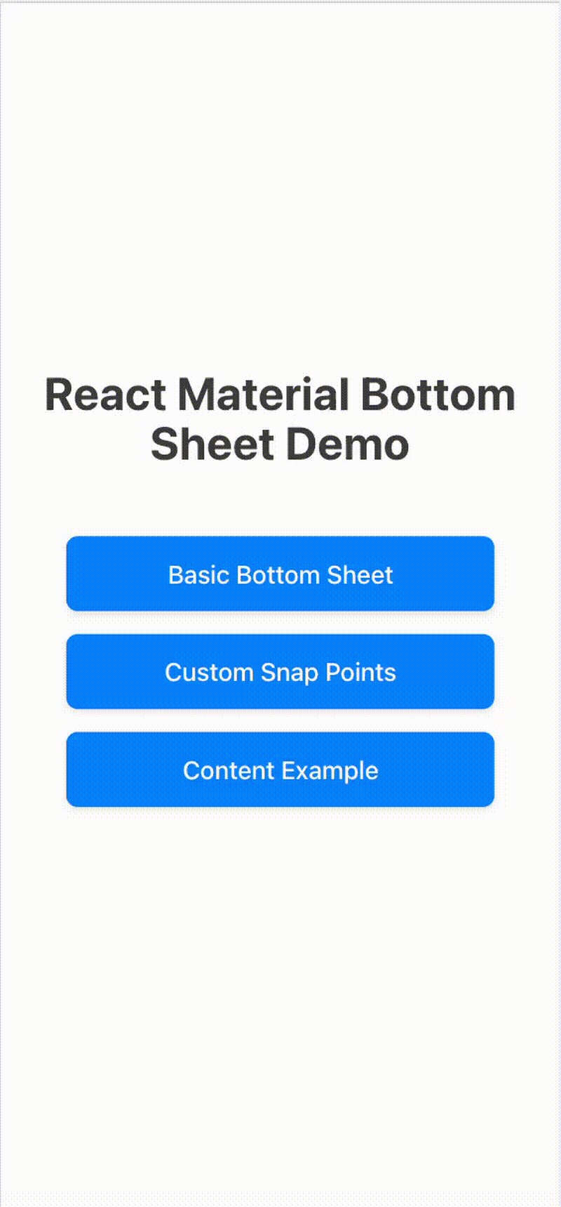
Welcome to React Material Bottom Sheet! This library provides a React component that mimics the Android Material Design bottom sheet behavior.
Installation
Install the package using npm:
npm install react-material-bottom-sheet
Or using yarn:
yarn add react-material-bottom-sheet
Basic Usage
import React, { useState } from 'react';
import { BottomSheet } from 'react-material-bottom-sheet';

function App() {
  const [isOpen, setIsOpen] = useState(false);

  return (
    <div>
      <button onClick={() => setIsOpen(true)}>Open Bottom Sheet</button>
      <BottomSheet isOpen={isOpen} onClose={() => setIsOpen(false)}>
        <div>
          <h2>Bottom Sheet Content</h2>
          <p>This is the content of the bottom sheet.</p>
        </div>
      </BottomSheet>
    </div>
  );
}
Props
isOpen: boolean - Controls whether the bottom sheet is visibleonClose: () => void - Callback when the bottom sheet should closechildren: React.ReactNode - The content to display inside the bottom sheetsnapPoints: number[] - Array of snap points as fractions of screen height (default: [0.3, 0.8])initialSnap: number - Index of the initial snap point (default: 0)
Drag-to-close and fling
This library supports closing the sheet by dragging it down. By default a quick downward fling will close the sheet, and dragging near the bottom of the viewport will also close it. These behaviors are configurable via closeOnDragDown and closeOnDragThreshold props.
Features
- Material Design Compliant: Mimics Android Material Design bottom sheet behavior with proper animations and styling.
- Drag & Fling Support: Users can drag to snap points or fling to close the sheet.
- Customizable Snap Points: Define multiple snap positions as fractions of screen height.
- Accessibility: Supports keyboard navigation (Escape to close), focus management, and ARIA attributes.
- TypeScript Support: Fully typed for better development experience.
- Lightweight: Minimal dependencies, optimized bundle size.
Advanced Usage
Custom Snap Points
<BottomSheet
  isOpen={isOpen}
  onClose={() => setIsOpen(false)}
  snapPoints={[0.2, 0.5, 0.9]}
  initialSnap={1}
>
  <div>
    <h2>Custom Snaps</h2>
    <p>This sheet snaps at 20%, 50%, and 90% of screen height.</p>
  </div>
</BottomSheet>
Drag-to-Close Behavior
<BottomSheet
  isOpen={isOpen}
  onClose={() => setIsOpen(false)}
  closeOnDragDown={true}
  closeOnDragThreshold={0.1} // Close when dragged below 10% visible
>
  <div>
    <h2>Close on Drag</h2>
    <p>Drag down quickly to fling-close, or drag near bottom to close.</p>
  </div>
</BottomSheet>